
You hear it so often, you have to be impressed with the way the climate denialists circulate their memes, especially this one headlined by the Daily Mail:

(In) the last 13 decades, the past three have been the warmest — and increasingly so. Check out this graph unearthed by Ezra Klein on the Washington Post:

The gray line is the long-term average for 1961-1990 (57 degrees F).
By aggregating the data in decades, the outliers become part of the trend, and the trend over time becomes apparent.
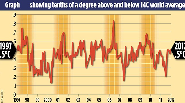
But again – as I’ve noted in the posts below – the period from 1931 to 1981, roughly half a century, show no average increase. Why focus on the last 16 years when there’s a stronger evidence that global warming isn’t real?
Because then you’d have to show that period in context, unlike the chart that ‘proves global warming stopped.’


Have you nothiing better to do Gord that promote your twaddle . . .
http://www.globalresearch.ca/co2-and-the-ideology-of-climate-change-the-forces-behind-carbon-centric-environmentalism/5342471
. . . no intelligence person denies global warming: nor global cooling. The world’s climate changes constantly! We just do not blame it on you!
Many people want climate change to be humanity’s fault, I think it gives them a sense that humans are big, humans are important. I can’t help but picture them strutting around with their chest inflated, believing that humans are just so exceptional. Lol!
There’s no global warming…
There seems to be a trend where graphs showing global warming never use random colours; there is always a progression from cool to warm colours, as in the graph above. In the graph above of course, there is the unspoken implication of the next colour beyond orange… (!!RED!!) …and what that means for our planet.
I have not done an extensive survey, but I have noticed it enough to notice it. For me it smacks of fearmongering (the above referenced implication) which I think does the climate change industry no credit.
“climate change industry” Ha ha!
There’s a progression from cool to warm colours because the bar chart is depicting a progression from cool to warm temperatures. Using random colours would be sloppy design. It’s representational techniques 101, buddy: always use the appropriate colour progression to convey your data correctly!
The climate change industry has no credit to begin with.
Of course you all know that global temperature can only be measured using satellites and records only go back to 1979.
What kind of satellites were they using to measure global temperatures back in 1880?
tree rings and ice samples.
…rock samples, soil sediments, coral, written records which date back to ancient times…
Exactly, and yet the graph above has global temperature measurements to the 1000th of a degree C. From tree rings, ice cores, rock samples, corals, and ancient written records? I don’t think so.
I mean what fool would believe such rubbish?
Lol!!!
LOL indeed!