
Eventually there will be Biennale installations at many of the Canada Line stations. First up, though, is “History of Loss” at the King Edward Station:

 This piece is by Indian artist Sudarshan Shetty. The artspeak description: “Although inspired by VW Beetle childhood toy cars, the reference here is multitudinous, iconic combustion engine vehicles entombed and dated as artifacts, reflecting the consciousness and worldliness of young contemporary Indian artists.”
I’m as big a fan of multitudinous, iconic artifacts as the next guy, but the part I like the best is that it’s next to a rapid-transit station that has all the charm of a tomb.

Michael Geller agrees.
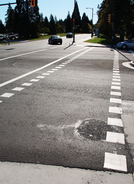
And while we’re here, can anyone explain what this crosswalk is about? Why the dotted lines?





My understanding is the dashed crosswalk is for cyclists and they do not have to dismount and walk their bikes when using the crosswalk.
There are a number of places on the Central Valley Greenway where similar markings are used.
I assumed it was for bikes too – but you’d think they should be on the other side of the pedestrian crosswalk so as to allow access to the bike lanes on Cambie.
It is a crossbike so cyclists can legally cycle across the street here. The city needs to do a much better job of explaining what all the new crossbikes, sharrows and bike boxes are and how cyclists, peds and motorists should use them.
Unfortunately, there are no bike lanes on this section of Cambie. This crossbike is for cyclists heading easbound on KE who want to access the station. That is why it is on the west of the crosswalk.
Regarding the tomb-like nature of the station, the intention is to bury it in a four story building. I suspect the building has been delayed due to the recession.
The new dotted crosswalks on the Great Northern Way portion of the Central Valley Greenway have posted signs explaining what they mean. Did they not do this at Cambie & King Ed?
A ped/bike logo painted near either end of the crosswalk would explain it inexpensively, without words or the need for a pricier sign on a post. It’s the same familiar logo used on shared portions of the Seawall.